“To give them that multitude of facts, voices, and perspectives, you want the UI to disappear and not be a sense of overload or cognitive load on them but just be transparent.”
Google on Tuesday launched a redesigned desktop version of Google News that introduces a more streamlined design, highlights fact checking, and offers users additional personalization.

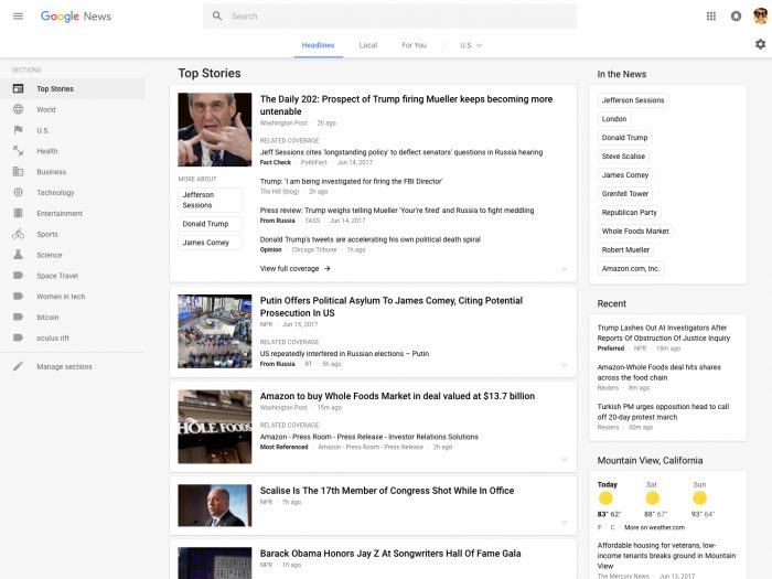
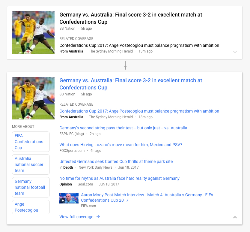
Google News’ desktop site is now broken into three main sections: Headlines, which features the day’s top news stories; Local, which allows users to follow news from certain locations; and For You, which contains specific topics a user has said they’re interested in. The redesign also introduces a card-based interface that is less cluttered than the previous iteration of Google News. The new layout is meant to highlight publisher titles, article labels, and offers more prominence to video. Users can also expand the cards to show more coverage on a certain topic.
Google News product manager Anand Paka said users often found the previous version of Google News too cluttered and confusing.

“Our goal here was to make every frequent task and every user need smooth and frictionless so they are connected to the news and journalism, which is why they come to Google News — to read the news and find out what’s going on,” Paka said in an interview. “To give them that multitude of facts, voices, and perspectives, you want the UI to disappear and not be a sense of overload or cognitive load on them but just be transparent.”
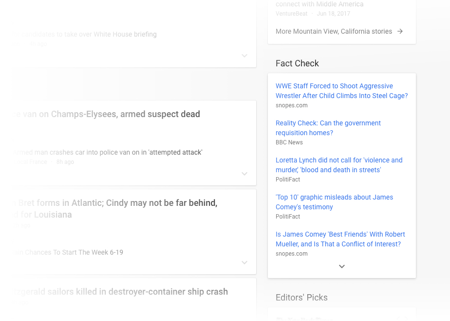
Google News is also introducing a fact-check widget on the right side of its homepage that more prominently displays stories from fact-checking sites such as PolitiFact and Snopes. (Though you’ll probably have to scroll a bit to reach it.) For now, the Fact Check addition is only available in the United States, but Google says it plans to roll it out more widely soon.
While Facebook has borne the brunt of controversy around fake news in the wake of the 2016 election, Google has also come under repeated scrutiny for promoting dubious stories in search and news results.
Google Home giving that horrible answer to “are women evil” on Friday. Good article on issues; I’ll have more later https://t.co/EUtrx4ZFul pic.twitter.com/Ec8mEqx8Am
— Danny Sullivan (@dannysullivan) 4 декабря 2016 г.
Last year, Google News introduced a fact-checking label for stories, and in April it began to showcase fact-checking sites in search and news results. (It’s important to note also that Google itself isn’t doing the fact-checking — it’s only highlighting nonpartisan sites, which limits the scope of what it can cover.) In April, it also launched “Project Owl,” a series of initiatives to try and promote more accurate content across its services.
This Google News redesign, however, is more focused on the user interfaces, Paka said.
“Because it’s a redesign, it’s more about the surface-type touches to the user for the most part,” he said. “Under the hood, we continue to use and build upon all the best practices both from search and as well as from Google News…We take an open-web philosophy. As long as a publisher is actively publishing news content, they are included in News and we maintain that policy bar for the people who show up in Google News. Once you have these quality sources within our index, then it’s about ranking and picking the best article to show at any given time.”
Still, the redesign aims to also give users more control of the coverage they see in Google News. The new interface makes it easier for users to manage the topics they want to follow. It also allows users to more explicitly prioritize or eliminate results from specific outlets.
Fo now, the redesign is primarily focused on the desktop site. Some features, such as the card-based interface, are already available on mobile, and Paka said he expects more changes to eventually come to mobile.
“We’re always trying to get all of these together, a consistent experience, but usually one of them one step of the other because we are trying to advance them in lockstep,” he said. “In this case, it’s a desktop launch. We expect mobile to converge on this over the short to medium term.”


